Responsive web design the ever changing landscape
Anyone who’s been involved in a responsive web design project will know it’s no easy feat to deliver a site that meets the demands of users, the business objectives of an organisation and all the technology challenges we have to face.
Creating a great experience across multiple devices, is hard!
The responsive landscape is constantly changing, new devices are regularly being brought to market and the technology we use to build websites and apps updates on a daily basis. In addition to this, users of digital products have higher expectations as they also experience the changes in the landscape.
As designers, developers, communicators and builders of digital products, we need to remind ourselves of the very nature of the medium we work with, it’s not a static medium but one which a user can interact with.
When Ethan Marcotte first coined the term ‘Responsive Web Design’ in November 2010 during his talk ‘A DAO of flexibility’ it was based on three core principles:
- A Flexible Grid
- Flexible Images
- Media Queries
These core principles shifted thinking on how we design and develop for the web and an advent of site redesigns began. Gallery sites such as Mediaqueri.es sprung up, giving us an insight how various sites responded to different screen sizes.
But responsive design covers a much wider range of variables than the three core principles.
Screen Size
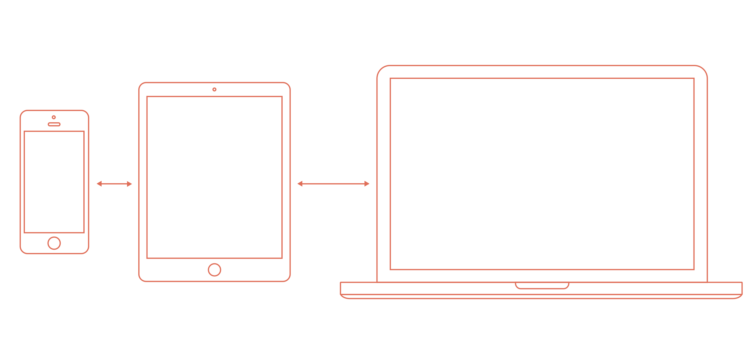
Screen size is one of the largest considerations we have to make in a responsive web design project and its really easy to fall into the trap of simply designing for the most common breakpoints. iPhones, iPads and desktops are often cited in design and build discussions but they don’t even begin to cover the vast device landscape that we have to work with.
In their 2013 Android Fragmentation report OpenSignal identified 11,868 distinct Android devices using their app. The data also indicated 100’s of unique screen sizes across these devices.

Device-Fragmentation
It’s becoming a recurring statistic that mobile and tablet website traffic is set to overtake desktop by mid 2014, but that doesn’t mean the desktop is being left behind.
Desktop computers in responsive web design seem to encapsulate a whole range of devices from portable 11” Ultrabooks to 27” iMacs, and where do hybrid devices like Microsoft’s Surface 2 fit in? The lines are becoming even more blurry when you throw varying pixel densities and retina displays into the mix.
Feature phones, smartphones, tablets and desktops make up a large proportion of the device landscape that we are designing for. They are not the only devices, however.
SmartTV / Games Consoles
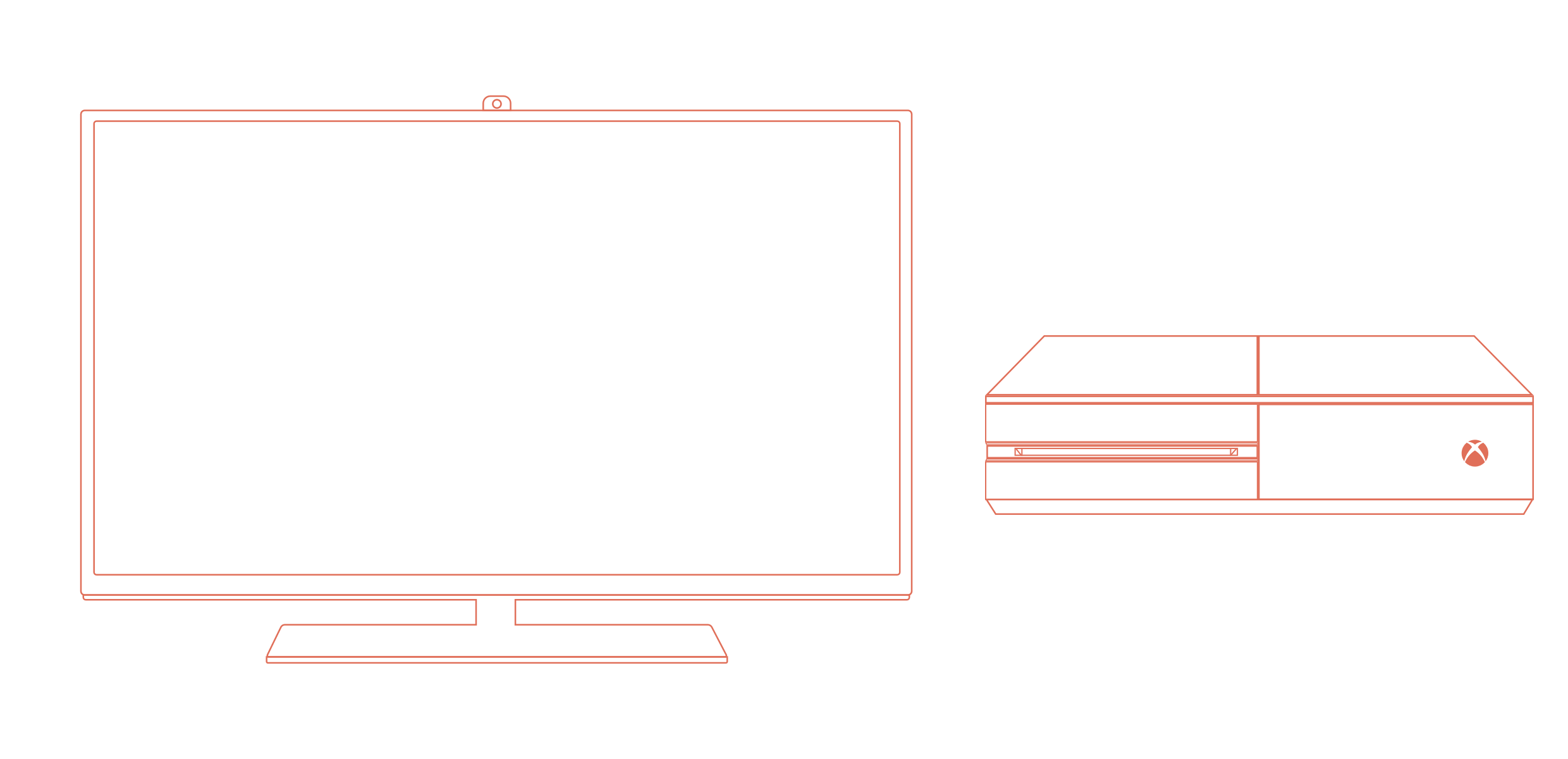
If you look around the modern home, you haven’t got to look very far to find a device that connects to the internet. Theres a good chance if you’ve bought a TV in the last 12 months it can connect to the internet and a series of online services. Smart TVs are becoming the norm in the living room, even my parents have one!
Whilst it may not be common place for you to fire up your games console to browse the web, or do your online shop, most consoles have capable web browsers and are improving all the time.
Have you ever considered what experience you are giving to a visitor to your site from these devices?
HiDPI & Retina Displays
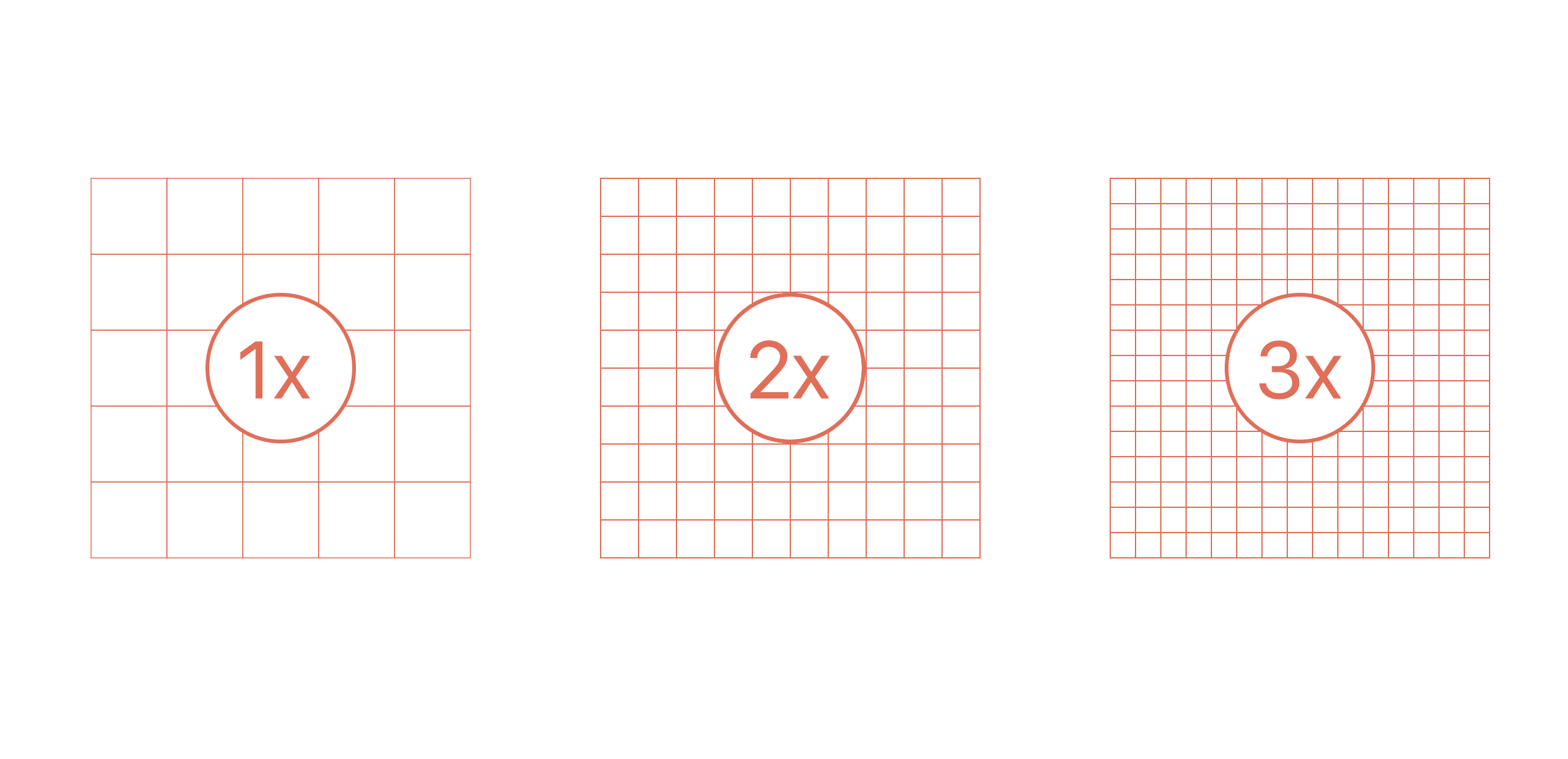
With devices like the MacBook Pro Retina, Google Nexus 10 and latest iPads and iPhones sporting retina displays, the web is beginning to look a little ugly.
That may sound like an exaggeration but with twice the amount of pixels crammed into the same space, images and icons are beginning to look pixelated and jagged and photos are no longer as crisp as they once were.
How we handle this has been an on-going discussion and a new draft spec has been born for the
With significant effort from the group and sterling contribution from Shawn Janspear a polyfill is available to use today.
Input Methods
Our websites can be viewed on a range of devices and screen sizes, but how our visitors interact with them can vary dramatically depending on the type of device used.
Touch
Smartphone and tablets have certainly increased the way we interact with technology and it always amazes me when I watch my nephews and nieces interact with with an iPad or iPhone, its somewhat natural.
Touch isn’t limited to our phones and tablets. Kiosks seem to be reappearing in doctors surgeries and shopping centres. Hybrid laptop/tablets like the Surface 2 are blurring the way we interact with these devices offering traditional keyboard and mouse input as well as touch.
Whilst touch appears natural we need to carefully consider how we design for these scenarios in our websites and applications to ensure it remains natural.
- Are touch targets large enough?
- Are touch events responsive? Is there any perceived lag?
- Is scrolling smooth when a user flicks content to scroll?
- Don’t rely on hover states to infer an action, is it obvious you can press it.
- Are components such as images galleries swipeable?
- And are you preventing your users from zooming into the page (never use maximum-scale=1.0 metatag).
Keyboard & Mouse
Its easy to assume that everyone can use a mouse to browse your website, but how easy is it to navigate it with a keyboard? Have you made the common accessibility clanger and set outline:none on the :focus state. Its common place when people don’t restyle the :focus element following a CSS reset. I know I’ve been guilty of it.
Ensure :focus states are styled. Use the appropriate input types to invoke the correct mobile / tablet keyboards. We can now consider hover state as a progressive enhancement. Have you set appropriate ARIA roles within your markup (I challenge anyone to navigate a complex site using a screen reader without them).
Gestures & Speech
Gesture and speech input are fairly new input methods compared to keyboard, mouse and touch, but they are rising in popularity.
Whilst these input methods may not drastically change the way you deal with responsive design they have some bearing on how your users may interact with your site or product.
1.Google Chrome supports voice search in its desktop and mobile apps. 2.We’re seeing digital assistants like Siri becoming more popular. 3.The XBOX 360 supports gestures in its version of Internet Explorer. You can simply reach out to grab the page, then move your hand up or down to pan around the page. You can also pull the page towards you to zoom in or push it away to zoom out. Navigating pages is as simple as moving your open hand over a link and pressing it to click on it. 4.Leap Motion have produced a similar product to Kinect with their Leap Motion Controller that enables Mac and PC users to interact with their computers using gestures. 5.Not forgetting most laptop trackpads offer some sort of gesture support; at a minimum two finger scrolling but may also offer pinching, swiping or multitouch gestures.
Be aware if you use any custom gesturing libraries for components such as maps or photo galleries on your site you may be breaking an existing experience.
Performance & Connectivity
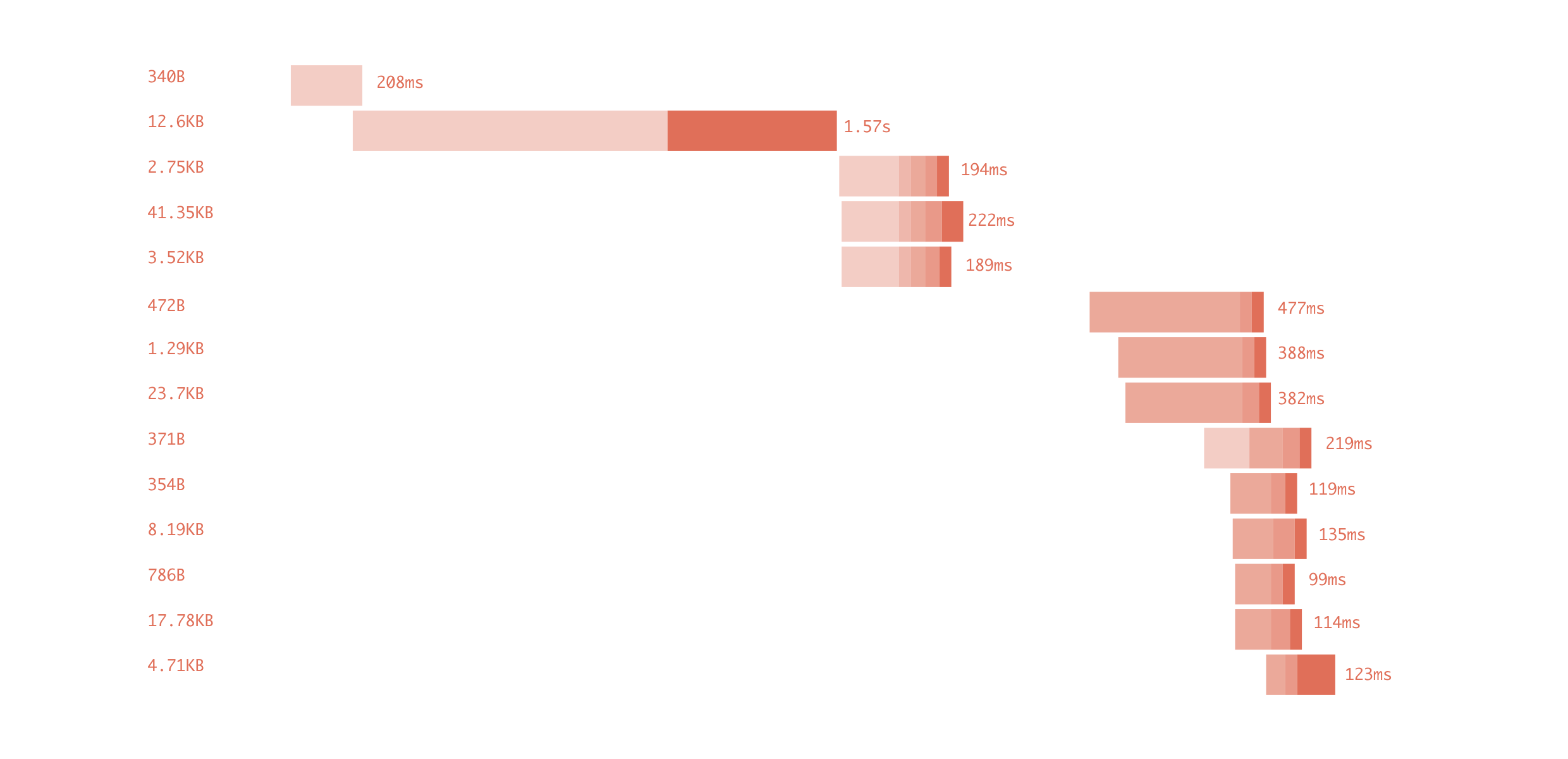
As we continue to design for an evolving web, the places that we consume content or interact with sites can vary. Whether thats on a train or tube, on the high street, in the comfort of our own home or walking in the countryside. There’s usually no limit to where we can access the web, and we can’t assume we know where those users are simply by the device they are using.
Designing for performance should be an integral part of the responsive web design process, but is often considered an afterthought at the end of a project.
To avoid this pitfall it may be worth setting yourself a ‘Performance Budget’. Whilst its not a new concept, it can considerably change the conversation of what should and shouldn’t be included as part of the design process.
The BBC have a huge audience, a considerable volume of content and its something they take seriously and they attempt to make the page usable in less than 10 seconds on a GPRS connection. That’s no easy feat. To see how the team behind BBC News approach RWD checkout Responsive News.
There is plenty of good material on how to improve performance, but if you’re looking for a short read and primer dealing with performance on the web I wholeheartedly recommend A Pocket Guide to Web Performance by Andy Davies and at £2 its a steal.
Summary
We design for a medium that’s constantly changing and at times it feels hard to keep up. We can constantly add to the variables that affect our work. We can’t control where people consume our content or expect to interact.
We’re not designing for mobiles or desktop but for a changing web.

 {% endif %}
{{ webmention.author.name }}
{% endif %}
{{ webmention.author.name }}